
How To Build A Color Palette From A Single Base Color
3 min read
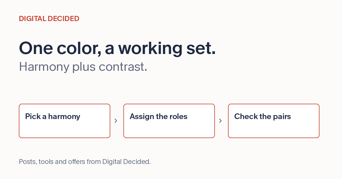
Most palettes start as one color somebody likes. The brand red, the header blue, the green from the logo. The job is turning that one color into four or five that hold together on a real page, with text, buttons, backgrounds and states that don't fight each other.
The Classic Harmonies Are Starting Points
Color harmonies are just recipes for picking the other colors relative to your base.
Complementary takes the color opposite yours on the wheel: a blue base gets an orange partner. The pairing stands out, so one of the two usually dominates.
Analogous picks the neighbors of your base. The colors share undertones and sit comfortably together, but neighboring hues give you little contrast, so text and buttons need help from lightness differences.
Triadic spaces three colors evenly around the wheel. It gives variety, and it needs discipline: pick one as the lead and let the other two appear in small doses.
Monochrome stays with one hue and varies lightness and saturation. Its risk is flatness, so the range from light to dark within the hue does the heavy lifting.
None of these is a design. They're raw material that still needs roles assigned. A harmony tells you the hues sit together; it says nothing about whether any pair of them is readable, which is a separate, measurable question.
Give Each Color A Job
Assign each color a role. Decide which color is the background, which carries text, which is the action color for buttons and links, and which is reserved for moments that need attention: errors, warnings, highlights.
The common failure is spending the action color everywhere. If the buttons, the headings, the icons and the links all use the brand red, nothing on the page is a call to action. Restraint is what makes the action color work when it appears.
Check Readability Before You Commit
A palette that looks harmonious in a row of swatches can still fail in use, and the usual failure is text contrast. Body text on your background color needs enough contrast to read comfortably; WCAG sets measurable thresholds for this, and AA is the common bar.
Check the pairs you'll actually ship: body text on background, button label on button color, muted text on cards. Contrast depends on the specific pair, not on the harmony, so measure it rather than assuming a coordinated palette is a readable one.
Get The Codes Into Your Work
Hex codes are a widely accepted handoff format. If you're writing CSS, variables make later edits easier: this generator exports them as --color-1, --color-2 and so on, so rename them by role (--color-action, not --color-red) after you paste, and a future palette change edits one line.
The Color Palette Builder on DigitalDecided does the generation step. Enter one base color, choose complementary, analogous, triadic or monochrome, and it produces a five-swatch palette with hex codes and ready-to-paste CSS variables, computed in your browser. Click any swatch to copy its hex.
Generate the harmony, assign the roles, then run the text pairs through a contrast check.